Typography

On this page...
Typography is essential to the Australian Museum’s brand. It should be functional and clearly communicate its message. It should also reflect the tone to further enhance the message.
Typeface
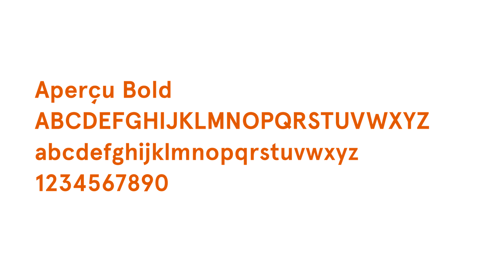
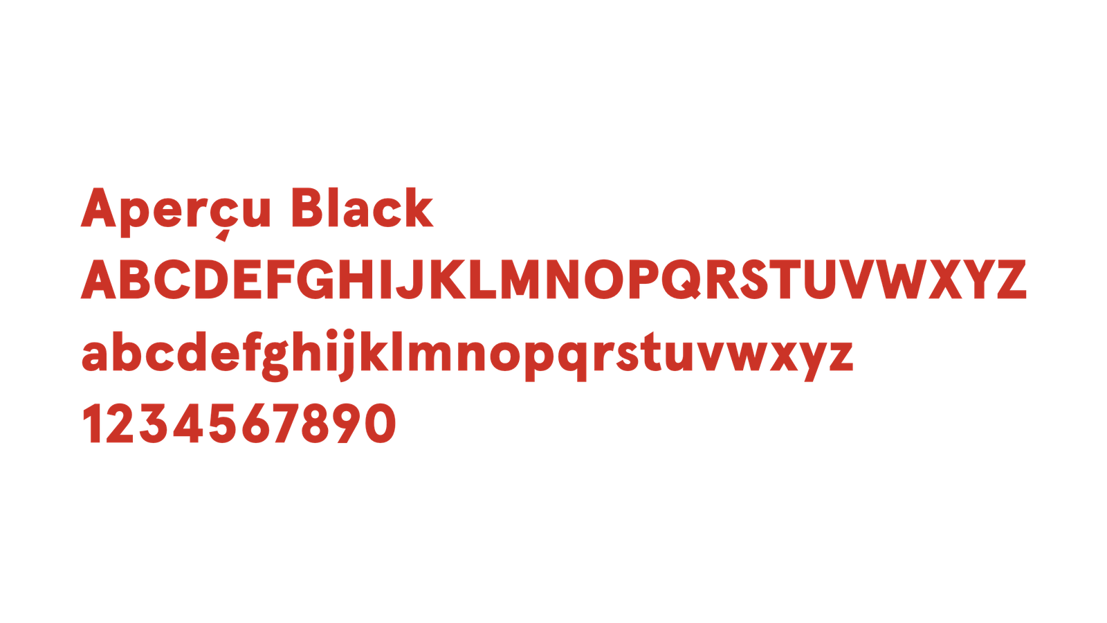
Apercu is the typeface for AM marketing and communications. It’s a contemporary sans-serif typeface with a variety of weights. It has the ability to convey excitement and curiosity or calm and seriousness.
Alternate fonts
Arial is the system font alternative. It should only be used for internal communications when the brand typeface is unavailable. All external communications and promotions must use Apercu.
Hierarchy
The hierarchy of typography is important to achieving effective communication. Below is a style guide to achieving the desired look and feel. Use as a guide and adapt when appropriate.

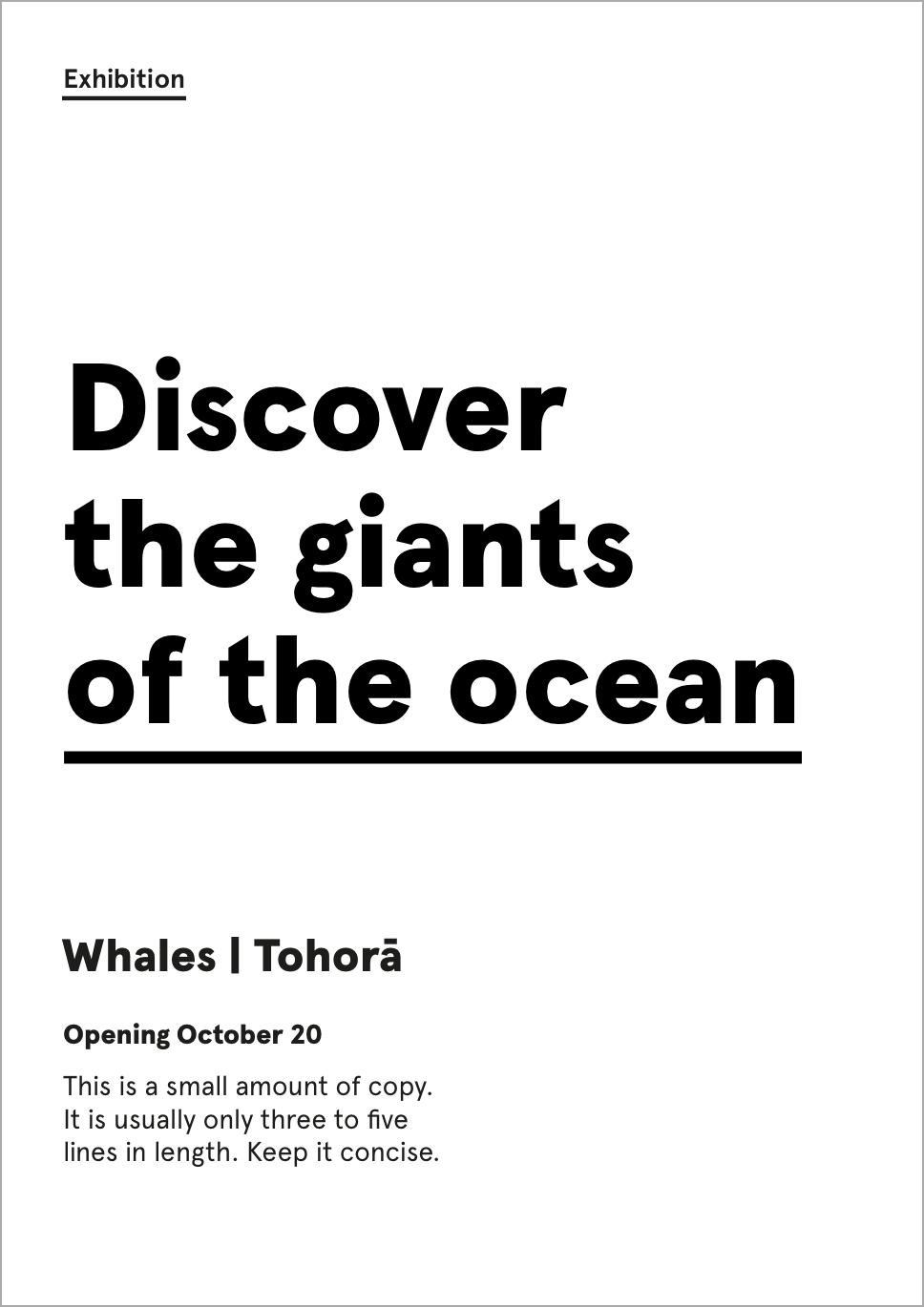
This a guide to achieving the desired look and feel for AM typography
Image: AM Design Studio© AM Design Studio
The main heading and the accompanying imagery are the main focal point of communication.
Style options
There are two options for main headings.

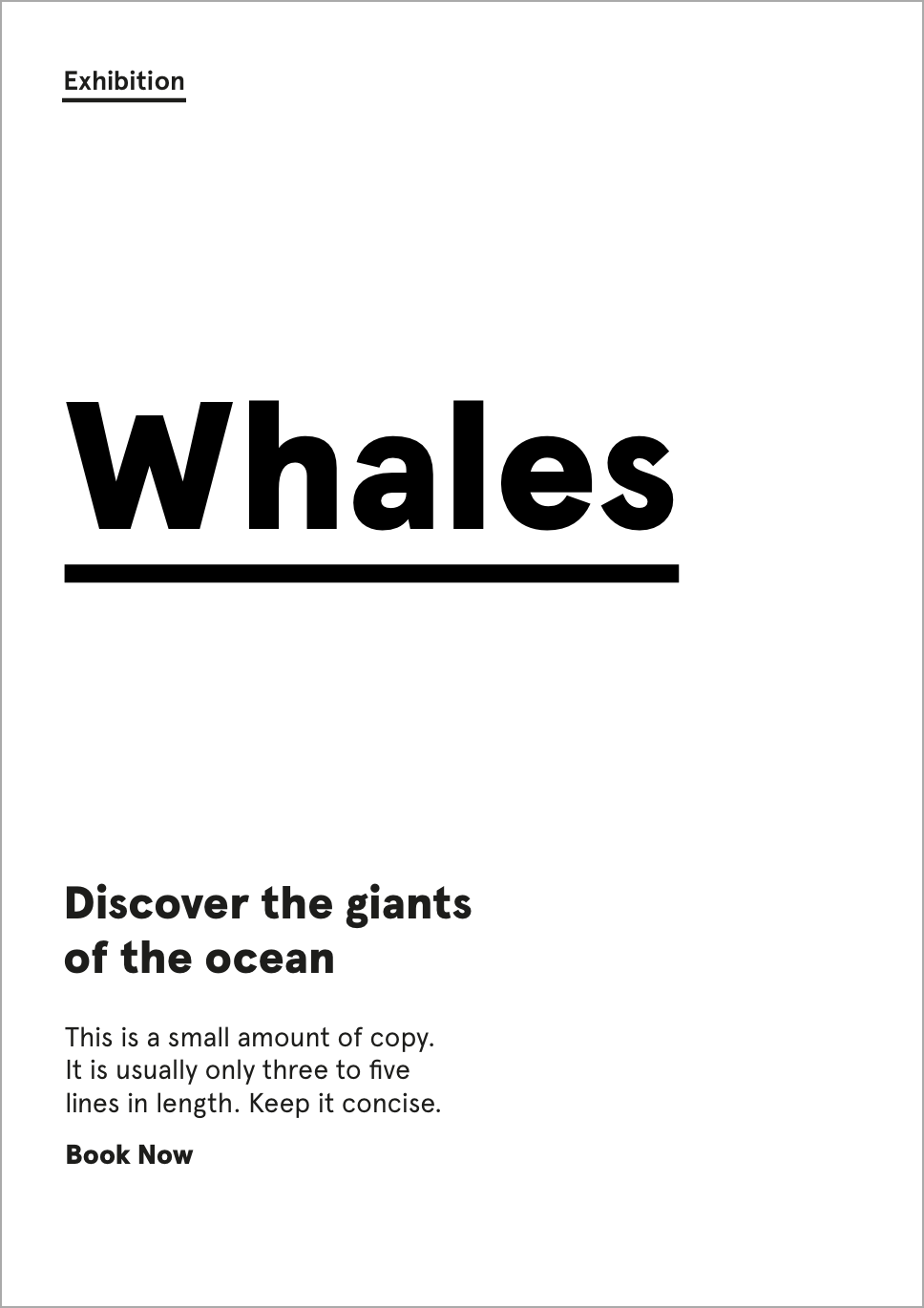
Options for main headings
Image: AM Design© AM Design
Option 1: Title Casing
Apercu Black / Leading: 110% font size / Align: Left
Option 2: All Caps
Apercu Black / Leading: 110% font size / Tracking: 100 / Align: Left
Font size
Use an appropriate size that will balance the layout. The main heading and the imagery should remain the focal point of the design.
Underline
Underline is only applied to the last line of the heading. Use the same unit of measurement as the font size i.e. point or pixels
Colour: Same as text / Weight: 10% font size / Offset: 20–30% font size. Underline should not touch descenders.

Example of subheading level 1
Image: AM Design© AM Design
Apercu Black
Font size: 2x body copy
Align: Left
No underline

Example of subheading level 2
Image: AM Design© AM Design
Apercu Black
Font size: same as body copy
Align: Left
No underline

Example of body copy
Image: AM Design© AM Design
Apercu Regular
(Medium to help legibility)
Align: Left
Long form
For large amounts of copy in print e.g. reports and newsletters
Font size: 8.5pt
Leading: 11.5pt
Short form
For short paragraphs e.g. posters and signage
Font size: use a suitable size
Leading: 130%/1.3x font size

Example of the descriptor
Image: AM Design© AM Design
Apercu Bold
Align: Left
Font size: these have been set in the templates. For non-standard layouts match the nearest template size.
Underline
Underline is only applied to the last line of the text. Use the same unit of measurement as the font size i.e. point or pixels
Colour: Same as text / Weight: 15% font size / Offset: 20–30% font size. Underline should not touch descenders.

Example of the credit labels
Image: AM Design© AM Design
For credits to sponsors and partnerships
Apercu Bold, all caps
Font size: min 5.5pt
Leading: 120%/1.2x
Tracking: 75
Align: Left
Examples